Code
library(tidyverse)
library(ggplot2)

knitr::opts_chunk$set(echo = TRUE, warning=FALSE, message=FALSE)library(tidyverse)
library(ggplot2)
knitr::opts_chunk$set(echo = TRUE, warning=FALSE, message=FALSE)Read Autralian Marriage tidy data file.
ab_nyc <- read_csv("_data/AB_NYC_2019.csv",
                   show_col_types = FALSE)
ab_nyc
# A tibble: 48,895 × 16
id name host_id host_…¹ neigh…² neigh…³ latit…⁴ longi…⁵ room_…⁶ price
<dbl> <chr> <dbl> <chr> <chr> <chr> <dbl> <dbl> <chr> <dbl>
1 2539 Clean & … 2787 John Brookl… Kensin… 40.6 -74.0 Privat… 149
2 2595 Skylit M… 2845 Jennif… Manhat… Midtown 40.8 -74.0 Entire… 225
3 3647 THE VILL… 4632 Elisab… Manhat… Harlem 40.8 -73.9 Privat… 150
4 3831 Cozy Ent… 4869 LisaRo… Brookl… Clinto… 40.7 -74.0 Entire… 89
5 5022 Entire A… 7192 Laura Manhat… East H… 40.8 -73.9 Entire… 80
6 5099 Large Co… 7322 Chris Manhat… Murray… 40.7 -74.0 Entire… 200
7 5121 BlissArt… 7356 Garon Brookl… Bedfor… 40.7 -74.0 Privat… 60
8 5178 Large Fu… 8967 Shunic… Manhat… Hell's… 40.8 -74.0 Privat… 79
9 5203 Cozy Cle… 7490 MaryEl… Manhat… Upper … 40.8 -74.0 Privat… 79
10 5238 Cute & C… 7549 Ben Manhat… Chinat… 40.7 -74.0 Entire… 150
# … with 48,885 more rows, 6 more variables: minimum_nights <dbl>,
# number_of_reviews <dbl>, last_review <date>, reviews_per_month <dbl>,
# calculated_host_listings_count <dbl>, availability_365 <dbl>, and
# abbreviated variable names ¹host_name, ²neighbourhood_group,
# ³neighbourhood, ⁴latitude, ⁵longitude, ⁶room_type
# ℹ Use `print(n = ...)` to see more rows, and `colnames()` to see all variable namesThis data set looks like a customer review collected by a company. It contains nearly 50,000 people’s review and each data distinguished by their id, neighborhood, and etc.
First of all, I took a look about their neighbourhood group. I choosed bar graph because it can be recognized easily.
count(ab_nyc, neighbourhood_group)# A tibble: 5 × 2
neighbourhood_group n
<chr> <int>
1 Bronx 1091
2 Brooklyn 20104
3 Manhattan 21661
4 Queens 5666
5 Staten Island 373ggplot(ab_nyc, aes(neighbourhood_group)) +
geom_bar()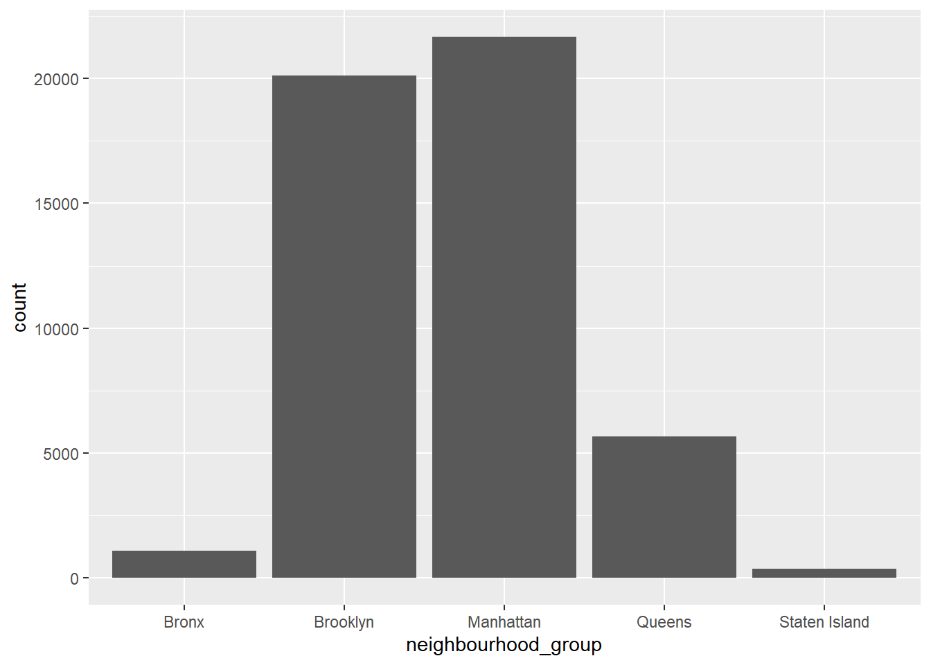
Most neighbourhood group are Manhattan(21661) and Brooklyn(20104).
Next, I took a closer look at the Manhattan.
ab_nyc_man <- ab_nyc%>%
  filter(neighbourhood_group=="Manhattan")

count(ab_nyc_man, neighbourhood)
# A tibble: 32 × 2
neighbourhood n
<chr> <int>
1 Battery Park City 70
2 Chelsea 1113
3 Chinatown 368
4 Civic Center 52
5 East Harlem 1117
6 East Village 1853
7 Financial District 744
8 Flatiron District 80
9 Gramercy 338
10 Greenwich Village 392
# … with 22 more rows
# ℹ Use `print(n = ...)` to see more rowsggplot(ab_nyc_man, aes(neighbourhood)) +
geom_bar()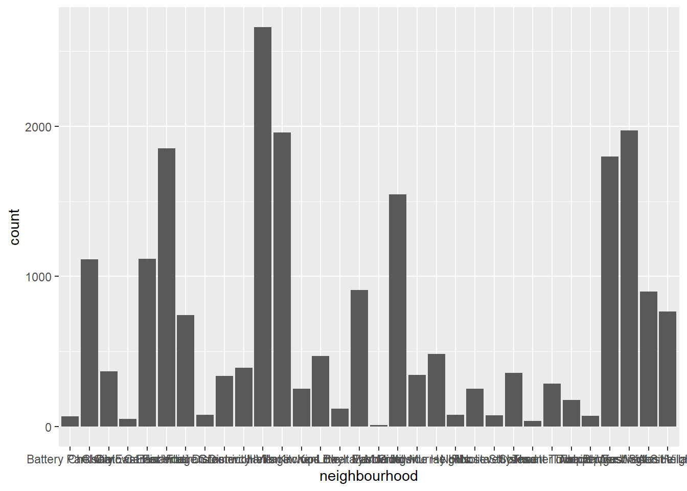
32 neighbourhood are in the Manhattan and Harlem’s proportion is the largest.
Now, I wondered whether availity and amount of review is related. So I made scatter plot regarding availity and reviews per month. I selected review per month to avoid distortion due to subscription period, etc.
ggplot(ab_nyc, aes(x=availability_365, y=reviews_per_month)) +
  geom_point()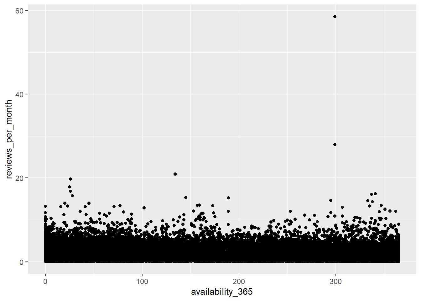
Anything is hard to recognized. It seems like there are no relations between availity and amount of reviews.